Introduction: The Background
This project examines typography in advertising over time. It considers the origin and the current state of the art in order to make a reasonable prediction about where it is going. Typeface or typography has been studied in psychology as it relates to educational theory, early reading ability, learning disabilities and public response to advertising. Even though design is permanently attached to typography, there was not a lot done in research of the balance among the various elements until very recently. This is possibly due to the fact that typography was not something any ordinary person could do. However, with the advent of affordable multi-purpose computers and software, anyone can be a graphic designer or a typographer. The tools come preinstalled on many lower priced computers in an effort to add value for the customer. This has occasioned an explosion of type and design, such as has never before been seen. At the same time, it brought the typographer’s art to the edge of chaos, since all these amateurs were designing their own typefaces and floating them out to a public that eventually began to see them as noise.
Advertising campaigns rely on type and image and the appropriateness of the two, working concurrently, It is of fundamental importance that appropriate type is used to capture the true essence of what it is a campaign is trying to promote. For, instance if you were advertising legal advice for a law firm, you would show more typographic restraint by using something classic, authoritative and strong, like Helvetica. Using Comic Sans Serif, on the other hand, would be like sending a clown to do a barristers job. It is imperative in order to gain a wider understanding of the rules regarding type because it empowers client and company personnel to become involved in the design and creation process(Looking for the right type. 2006).These are the salient attributes of typography.
Aims of the Paper
It is imperative for me to have gain a complete understanding of the use, conventions and theories regarding type, because it will enable me to understand typefaces as if they were individuals, each with its own character and quirks. I intend to complete an ISTD (International Society Of Typographic Designers) Award brief and I will carefully consider all that I learn from this project. I intend to strive for this prestigious award and believe that by investigating typography and how the use of a typeface can define the personality of an advertising campaign, I can gain a more practical knowledge and understanding of the field. Basically, all that I can add to my knowledge of the field will only help to refine my skills in order to prepare myself for future projects as I seek my own place in the world of typography.
Questions that I seek to answer include:
- What factors make for an interesting campaign?
- What can we learn from successful campaigns?
- How does modern technology aid the creative process of typography in a campaign compared with advertising in the early 20th century?
In order to understand typography today we need to determine how and how much people react to print fonts, color, music and content in advertising. It is necessary to determine what the most important factors are of an advertising campaign? We should try to judge how much we can gather about the importance of type from previous campaigns? Finally there is the question of how modern technology aids the creative process of building a campaign compared with advertising in the early 20th century. Has the easy accessibility of a typeface to the public at large democratized typography or made it more the property of the elite designers? So basically the aims of this paper are to identify the current state of the art, look at various case studies and campaigns and try to find the commonalities and identify the most important attributes of good typography.
Methodology
We will begin by examining the history and theory behind typography and advertising design as demonstrated by the literature. Then we will examine some advertising campaigns and study these in the literature. Finally we will analyze one particular advertising campaign and identify the factors which have the most impact. We will show the ad to a number of people to get their responses. We will select people who speak no English and those who do, in order to see what difference there is between these groups of respondents.
By breaking a campaign down to its basic elements; I hope to be able to put the use of typography into context. Currently, I feel that type can only ever be considered as of more value than an image working on it’s own. I think an image needs type in order to function properly. I feel that type can put an image into context. Our understanding of advertisements and how we perceive the tone and context is nearly always explained by some kind of tag line.
Considering the hierarchy of information, images on their own are too open to different interpretations. I will look at previous historical and contextual examples of typography working in advertising campaigns to try and gauge how typography has previously been used in order to establish its importance within the field of advertising. I will also question the modern technologies available to the typographic designer today, and try and establish that, compared with the relative lack of technologies available to the typographer of the early twentieth century, whether the creative process has changed only a little or to a large degree.
I believe that this is an important topic for study, because the availability of fonts for everything that a computer can do makes many people want to try it. We want to know how this affects the overall subject area of typography. Will fonts for computers make typographers obsolete or shift their focus? Will advertising move into digital only or will soilid typeface always be used? How has advertising been changed by the development of more and more complex type?
I feel my dissertation title is important for me a designer to gain knowledge of typography and advertising by not just looking at things I like but to analyze and find meaning from pieces of art and design. Typography is my field of interest and I feel it has to work harder in a consumer based economy, and if typography is to facilitate the communication of text, or even carry it all, then we need to examine all aspects of typography more closely, not just what works, but how and why. My research process is the most exciting prospect for me; as it gives me an opportunity to not only extend my knowledge but to discover inspiration for my current and future assignments.
I plan to structure my dissertation with case studies that I can examine in order to again further advance my argument that Typography is an essential part of advertising and has a lot to do with the understanding and therefore the success of a campaign. My case studies will be as follows:
- Pirelli Tyres Campaigns, designed by Alan Fletcher.
- Absolut vodka, designed by TBWA
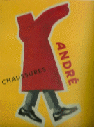
- André by Albert Lévy 1896
This combines the literature review with analysis of product resulting in an amalgam of theory, history and analysis.
Literature Review
Probably the first real typographer was Johannes Gutenberg, who invented movable type more than half a millennium ago. “His invention changed the world of typography, in fact, his invention changed the world.” (Kepes, Gyorgy 1944) In searching the literature one thing becomes quickly very clear. Typography has undergone rapid change within the last ten years, due to the availability of low cost, general purpose computers and software. Until the 1960s fonts were created in foundries. Ordinary people had to depend upon these foundries to create the type they used. In the movie Helvetica we meet a man who started work at the foundry for before he ever worked with digital type. It is probable that most people who use digital fonts have no idea where the fonts for printing come from and how they are made and used without the computer.
Typography developed from the time of Gutenberg, and it began to be examined later on by such as Roland Barthes(Allen 2003), who studied text from the socio-political viewpoint. He considered typography just another tool for propoganda, but also said in his last work that there was no end to text, only change. Followed by Jacques Lacan (Homer 2006), a psychoanalyst and scholar, who stated that the only reality is the symbol we see that between them we have the beginnings of a construction of a psychology of typography, including text, photos and type face. (Kepes, Gyorgy S. Giedion, Gyorgy and Hayakawa, S. I.1951)
Typography and other design disciplines are now being re-examined to discover the laws which govern their use. Doesburg applied his findings to typography concerning the principles of the plastic arts, those which are highly flexible and influenced advertising design and typography. He sought balance among the horizontal and vertical elements and the spaces within the type. New type faces incorporated the visual principles of painting. Reform was absolutely necessary, as anyone who looks at city street photographs from the 1940s and 1950s knows, and still our system is barely organized enough to be called a system. The same was true of magazine advertising. The pages of the 1940s and 1950s were a conglomeration of color, shapes and typefaces (McQuarrie, Phillips 2008) that was more like a child’s playroom than an advertising campaign. It is more like anarchy in type face. (Bennett, Paul A.1951) Bennett 1 thought type should be invisible, as the title of his book states. It should not even be noticeable. He likened type to a window, which could be stained glass and totally obscure the view within the pane, or be totally transparent glass, or small panes of clear glass, close together, which allow the eye of the mind to focus through what appears to be a lovingly made latticework of panes. Our subconscious mind focuses through the type and not upon it. This same psychological quirk of humans makes us react to anything which disturbs, such as tight spacing or too wide lines. We are jarred and the focus is broken. Bennett remarked, “It is tragically easy to throw away half the reader-interest of an advertisement by setting the simple and compelling argument in a face which is uncomfortably alien to the classic reasonableness of the book-face.” (Hayakawa et al1951)
Information design is the term for the art of mixing the content, structure, and appearance of documents. Since this is a new discipline, many of the practitioners come from such diverse backgrounds as architecture and instructional or graphic design. There are even technical writers and usability experts who have migrated to this field. Each of these disciplines engenders a different approach and focus in typography, from structural to aesthetic, focusing on content or visual psychodynamics and readability. Michael Golec (Soar 1951) For all of these, the use of typography is important and different.
Typography has been examined for more than its advertising efficacy. Some examined it from a socio-political aspect, noting that Helvetica came along about the time the world was reeling from massive wars and debilitating economic crashes. They said that it was a response to the need for a simpler and cleaner social environment. “It was McMurtrie’s articulation of speed that inadvertently corresponds to my inquiry into the interrelation of a modern typography that was (Paul A. Bennett, ‘always losing its balance and a depleted American economy. Was the dynamic of modern typography a dynamic of impoverishment that reflected a spiraling downward dive toward economic destitution?” Information designers consider all the dynamics interacting in a text, and control, through typography, “the composition, imposition, impression and paper” Stanley Morison )(Michael Golec 1949)
Saenger argues (1997)_that text can present lexical images only when the words are separated by spaces. This is based upon the cognitive processing of word pictures stored in our brains. With the spaces we are not forced to sound out the words. Laura Mandel proves this point by eliminating the spaces in poetry by Wordsworth and subjecting it to coding. By the same token, this shows that typography is more than artistic arrangement or even a facilitator of reading. It is a conveyer of meaning of itself.
Mandel suggests that typography can be used to decode original texts and identify extra meaning which has since been hidden by printing the poetry in modern fonts(Mandell 2007). There is simply more to typography than first meets the eye or the ear. No one element stands alone. They must all be used in perfect harmony to create a truly successful and beautiful product.
“The idea of ‘reading’ the city, or urban environment, was introduced by Kevin Lynch, for whom reading the urban structure follows on from recognizing or identifying its numerous visual elements, not necessarily verbal ones.” (Feasley, Stuart 1987)In looking at magazine ads from the 1940 and 1950s we see the same crowds of competing visual cues. The ads had their own character, which has since disappeared and been replaced by a cleaner, more utilitarian typography, because it was thought that it would more easily convey the message. It is interesting to note that cognitive science has since discovered that words in typefaces very different from their surroundings will stick in the mind better, and that mixing too many fonts destroys this strategic method for branding(Felker, American Institutes et al. 1980).
Richard Lowe undertook a study of graphics and animation, identifying that there is actual meaning in the form of a text(Lowe, Promono 2006)(Lowe, Promono 2006). We add graphics to explain or illustrate the words, but we can add graphics to convey a meaning of their own, such as the photo of the young orphan in the killing fields of the Mi Lai Massacre(, WGBH American Experience. My Lai ). Typography is a graphic form which exists separate from the words, and it carries its own meaning by its shape, color, density, placement and relationships with the surrounding text. Hartmut describes how type is at once the method for expression of text necessary just as sound is necessary for speech, but it also represents the Gestalt imagery which can add meaning to the text(Moore, Fitz 1993).
Lakoff and Turner point out that certain conventions in typography add tremendous meaning to text, as with Robert Frost’s “The Road not Taken” where the last line uses a long dash to convey a long thoughtful pause: “and I— I took the one less travelled by”(McCarthy, Mothersbaugh 2002).That seems to be what typographers seek to do.
Helvetica: The Movie
In Helvetica, a movie documenting the famous typeface created by Meidinger and Hoffman, there is an ongoing discussion concerning whether or not typography expresses the society within which it is printed. The various designers all have preferences for either Helvetica or anything but Helvetica, since it has been around for the entire modernist period. One artist suggested that he only needs Helvetica and can express everything by merely changing size, angle, placement and spacing. Others simply tired of Helvetica, while some simply design freely to suit the need.
Many theories of typography abound. Flesche insists that we should use only about 6 or 8 typefaces and put the rest on the wall for decoration. Business Source Complete takes this a step further and suggests that the amount of type on a page must be limites or the reader simply skips it.
Neville Brody was one of the very interesting characters in this documentary. He suggested that one cannot simply continue to pursue the new or that become old. He did say that of every ten people, only one could listen to a piece of music and then express how it affected them in art, as in an album cover. He has been publishing the typographic magazine Fuse and is responsible for many very successful ad campaigns. He touts the use of “intelligent design” and refuses to work for any company which is not planet friendly.
Currently the theorists and practitioners are expecting a lot of change in the world of typography. Digital is considered “not ready for prime time” and agencies who use both are expected to take the lead in the industry. However, digital work is considered to be necessary for survival, yet there is a belief that honest type face is not going to vanish just yet.
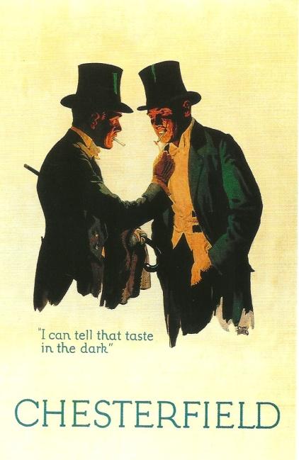
Alan Fletcher, graphic master and founder of Pentagram, came from an architectural background and brought a sense of play to his work. (PALLISTER 2010)He collaborated with Colin Forbes and Bob Gill on the Pirelli campaign, which was clean and modern with a hidden joke. Rather like a pun in graphics.
All of the people mentioned contributed a great deal to the field and more is coming from many.
Digital Versus Foundry Fonts
We have seen, especially in the Movie Helvetica, that digital creation of typography has become very important. However, as stated in the movie, it does not seem feasible for agencies to go totally digital yet. In fact, it may never happen for most agencies. Markup on the computer with a really big screen is unbelievably versatile and fast, Many different things can be tried in a very short time. The microspacing possible and the miniature blocking which smooths types like Microsoft Cleartype ® is much easier to read. However, for larger format jopbs, old fashioned paste up is better. Laser type is lovely, but printers’ ink simply cannot compete with good poster paint or other materials used in making mock posters. So it seems we still need a mix, and may for a very long time. Just as most people wonder why when they see a dot matrix printer running, older technology is not necessarily obsolete. Ink jets and laser printers cannot print multiple forms with carbons,
Case Studies
I have chosen these case studies because they give a good and varied overview, I have chosen André the French shoe chain from early late 19th century early 20th century because of the consistent use of strong typography and image and the era it’s from. I then chose Pirelli tyres designed by Alan Fletcher because of the influence the campaign had on young designers and typographers; also it is one of the most well known advertising campaigns notable for its design. I also chose Absolut Vodka because of its visual contemporary approach’ Each of these was particularly successful and an innovation at the time. I seek to identify any other commonalities.
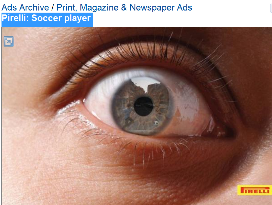
his ad was released simultaneously in several different countries, featuring slightly different colored eyes, but the soccer player reflection is easily seen in every one. It is interesting that most viewers do not immediately see the player and the ball, but the way the ad looks larger than life makes people look. When they see him and the logo together, it again is not an immediate connection. However, the logo is remembered, as it conforms to the concept of being very different from the surroundings. With it being the only text there are not multiple messages nor any confusion concerning the meaning. Subliminally we get the feeling of being too close to this driver, and we connect with the soccer player, though we assume that this motorist does not. The reflections in the eye are of two soccer players and a ball. In fact, there is a hint of a small wall also. These are supposed to contain a pun, but I could not figure it out. It appears that a driver got close enough to the players for them to reflect in his or her eyes. That would resuire good brakes and good tires. The ad does convey its meaning very quickly and the Pirelli is easily remembered. That it is not particularly collectable did not lessen its effect as an advertisement. The message thus communicated is very serious and shows a serious reason why the audience should buy Pirelli tires.
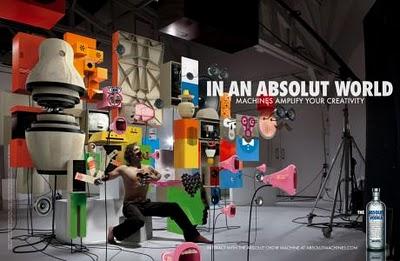
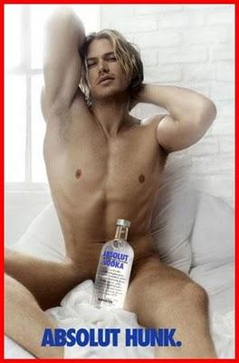
Absolut Vodka
Andree
In 1979 Absolut released the first of its simple elegant print ads which now span more than twenty successful years. The ads have actually become collectibles over the years, and made Absolut an instant star liquor. The campaign branded the word Absolut and stamped it on many liquid products. It won prestigious awards and carried an almost narrative text through twenty years, The shape of the bottle was instrumental in creating brand recognition. Here was a case where the symbol was the brand. It became an icon in advertising history, as the brand quadrupled its market share. The ads are individual works of art, some quite amazing graphics contained within the silhouette of the bottle and others quite startling shapes of the bottle made from something else. One has a whole set of light bulbs in the shape of the bottle, while another has the bottle shape indented into an arial rendition of Thesselonia. The bottle is sometimes a hidden object, or hiding an object, and at other all that can be seen. There are dozens of these and they are all interesting and beautiful. This is actually my favorite campaign of all thay I studied. Like Burma Shave’s verse on the side of the road, Absolut Vodka’s art in vulgar advertising made history. There has, so far only been one of each. It was the first time ever that a liquor had been sold as art. Every one of that ads made the statement that the bottle design was art, as befitted the high quality spirit.
The font used in Andree is very stylistic with a very interesting. The silhouette of the boot matches well with the style of the shoes walking it. This ad became the signage of many of the shoe stores. In 1889 it was really cutting edge. We have come a long way from this technology, but the basics of a great ad are all right here.
Comparative Analysis
In looking at what all of these ads have in common it boils down to the text, of which there is very little, the font and color which gets attention, humor and a type face which stands out from the rest of the ad. The ad below for Durex Condoms is different from all of these. It has a lot of text, much of it repetitive and most of it not easily readable. However, it does share a particularly striking color scheme and humor. The font and color used for the brand also stand out and a great deal of meaning is communicated by the text and the typography. The placement of the brand is hilarious. Even more funny are the words and their placement.
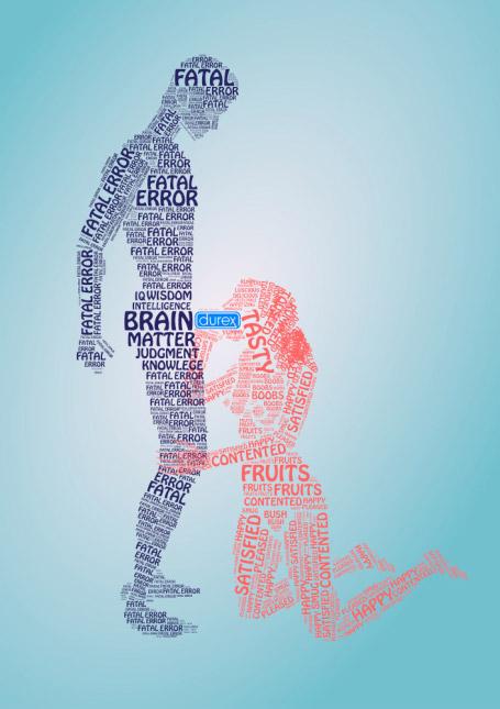
Durex: put citation here
There are actually not a lot of words in this ad. Most are repititions.Fatal is located where brain matter and heart are normally found, plus scattered everywhere, along with fatal error. The font used is rather playful, matching the graphic created with the words. There is a contrast of opposing emotions: fatal error versus contented and satisfied. The word tasty is located where the brand indicates the location of the product. The plain pastel background in variegated shades creates an soft background with no distraction from the ad. Two very important factors this ad shares with all the others are its innovative difference and its humor. None of these ads are forgettable. All carry messages with the typography in addition to the actual text. All have a lot of monocolor (or almost) space. The colors are balanced and the images are sharp.
Interviews about this Advertisement
Short interviews were done with this ad. 14 English speaking people and 12 Chinese speakers were given a minute to look at the ad. Then they were asked questions about it. When asked to describe it every participant could describe the image created by the type. The ad was shown to speakers of Chinese who knew no English by a colleague in Beijing. All participants found the ad amusing, The English speakers found it more amusing. The Chinese speakers noticed the type and know it was English and wanted to know what it said. When told they laughed. Only English speakers remembers the brand. All participants remembered the word Durex, though the Chinese speaker simply identified it as the word which was different.
Conclusions About the Durex Ad
So with Chinese speakers, the image and type carry enough meaning to make them remember it, but the brand is not legible enough to be remembered. All of them remembered the X. English speakers found the ad funnier by virtue of the inherent meanings of the simple words and their connotations. All but one remembered the brand.
Where is Typography Going?
Well, it is not going to amateurs. Yes creative amateurs can turn out some good stuff, but typography is more than setting type, fixing space or choosing color, It requires the same level of creativity as marketing or copy writing, and a great deal more practice and skill. Digital type, while useful, is not the end-all and be-all of typography. Technology will certainly help to create more innovation in the field, but solid tools are still the core base. Due to the tremendous amount of research going on we will learn a great deal more about this art in the next decades. We will cover psychology and cognitive processing, as represented by the Durex ad. Typography is more than just a means to build a brand and sell a product or service. It is a tremendously interesting art form. More people will be drawn to it as time passes and more research reveals it true complexity.
It does not seem as if the actual type will ever be replaces, because it serves a very good purpose which cannot be fulfilled by the computer and ink. Besides, a physical layout is often more useful, especially for larger formats.
Conclusions
This dissertation has barely scratched the surface of the art of typography. It is very obvious that it is changing fast due to technology. However, technology is simply not all there is to typography. There is a great deal of experience, creativity, artistic skill, humor, marketing knowledge and plain talent required for success in this field. A knowledge of psychology is helpful. Education psychology and cognitive processing also gives extra information to the researchers.
The field is being studied from several diverse disciplinary perspectives, including literature, marketing, art, psychology, cognitive processing and education. The researchers are coming up with some very interesting information due to the use of computers for measurements. Even using computers on older texts, which were either hand written or used fonts closely approximating handwriting gives some surprising results, such as showing that there was some kind of typography, even though hand executed, even then, administered by the authors. Wordsworth is an example. His text contains visual sound. That is, there are patterns which invoke the feeling of sound in simply seeing it.From the case studies we see that the current state of the art is quite exciting, but also very demanding. It would be interesting to see what happens to dyslexic people when spaces are removed from the text. For the Durex ad, I would like to have has the time to switch out the font and test different fonts, I would also be interested in changing the language and seeing what effect that has. In this way we could isolate the font and text in order to see where the power falls.One might try reversing this add with Chinese words in it and see what happens with speakers of Chinese and non-speakers.
Psychology is another area where scholars are studying typography. It impacts learning theory and possibly mood. Emotional cues are certainly passed via the content, but also via the typography. We looked at form versus content and looked lightly into animal response.
The case studies showed that successful advertising has certain things in common: little use of text, the brand set off in a different style and color, humor and readable font, They also share the humor and branding offset in common with the Durex ad.
By far the most interesting case in this paper is the Absolut Vodka ads. They have endured for more than twenty years and may just keep on going. People want these ads as works of art, and they still get attention, In fact there is quite a scramble to get the latest Absulut ad.
Appendix A: Images
Figure 1. Pirelli Tyres
Figure 2. Absolut Vodka
Figure 3. Absolut Vodka
Figure 4. Pincas, S. (2008). A History of Advertising, Taschen.
Figure 5. Web.
Figure 6. Pincas, S. (2008). A History of Advertising, Taschen.
Looking for the right type. 2006. B to B, 91(1), pp. 34-34., WGBH American Experience. My Lai | PBS.
ALLEN, G., 2003. Roland Barthes [electronic resource] / Graham Allen. London ; New York : Routledge, 2003.
Bennett, Paul A., 1951, “Printing Should Be Invisible,” in Books and Printing: A Treasury for Typophiles (Cleveland, OH: World Pub. Co., 1951), 114.
FEASLEY, F.G. and STUART, E.W., 1987. Magazine Advertising Layout and Design: 1932-1982. Journal of Advertising, 16(2), pp. 20-25.
FELKER, D.B., AMERICAN INSTITUTES, F.R., SIEGEL & GALE, INC., NEW YORK, NY. and CARNEGIE-MELLON UNIV., P., PA., 1980. Document Design: A Review of the Relevant Research.
Michael Golec, Michael, 2000,”A Typography of Impoverishment: D.c. Mcmurtrie’s Reception of European Modernist Typography and an American Economic Depression,” Visible Language 34, no. 3 (2000).
HOMER, S., 2006. Jacques Lacan [electronic resource] / Sean Homer. London ; New York : Routledge, 2006, c2005.
Kepes, Georgy,S. Giedion,S and I. Hayakawa,S.I., 1944, Language of Vision (Chicago: P. Theobald, 1944), 122.
LOWE, R.K. and PROMONO, H., 2006. Using graphics to support comprehension of dynamic information in texts. Information Design Journal (IDJ), 14(1), pp. 22-34.
MANDELL, L., 2007. What Is the Matter? Or, What Literary Theory Neither Hears nor Sees New Literary History, 38(4), pp. 755 776.
MCCARTHY, M.S. and MOTHERSBAUGH, D.L., 2002. Effects of Typographic Factors in Advertising-Based Persuasion: A General Model and Initial Empirical Tests. Psychology & Marketing, 19(7), pp. 663-691.
MCQUARRIE, E.F. and PHILLIPS, B.J., 2008. It’s Not Your Father’s Magazine Ad. Journal of Advertising, 37(3), pp. 95-106.
MOORE, P. and FITZ, C., 1993. Using Gestalt theory to teach document design and graphics. Technical Communication Quarterly, 2(4), pp. 389.
Stanley Morison, Stanley, 1936, First Principles of Typography (New York: Macmillan, 1936), 7.
PALLISTER, J., 2010. Alan Fletcher: Fifty years of graphic work (and play). Architectural Review, 227(1357), pp. 088-088.
Saenger, Paul, 1997,The Space Between Words: The Origins of Silent Reading (Stanford, CA: Stanford Univ. Press, 1997), 5–17 (hereafter cited in text).
SOAR, R.S., 1951. Readability of Typography in Psychological Journals. Journal of Applied Psychology, 35(1), pp. 64.